SHAPING LE QUARTIER MULTI.
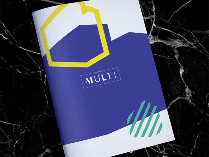
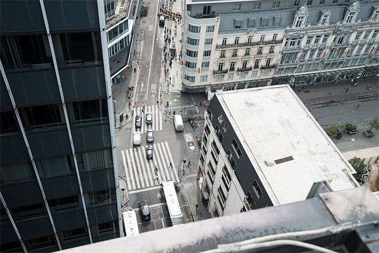
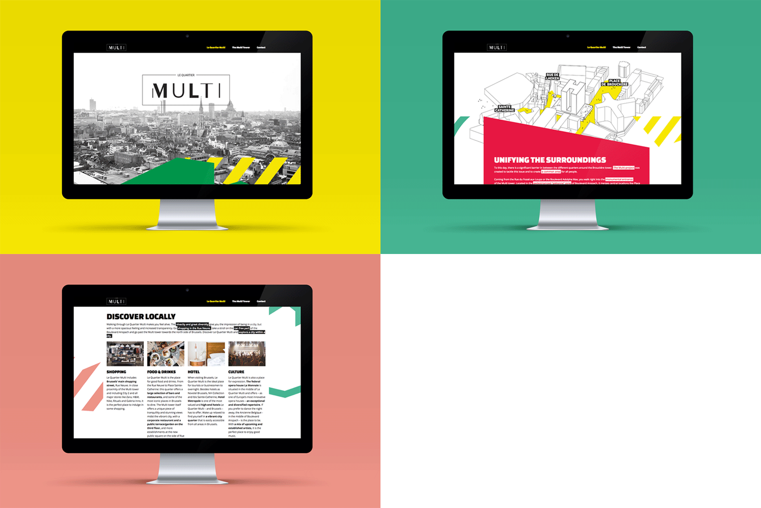
For Le Quartier Multi we created a branding and visual style that reflected the diversity of a large project in the city of Brussels. The integration of the project into the environment and it's polyvalent approach was key in creating this style. The shapes of the building became patterns. These patterns became buildingblocks for the branding in combination with black & white photography. The different colors and sizes made this branding extremely flexible, which is perfect for the wide range of applications. From magazine to responsive website.
CLIENT
Whitewood
AGENCY
King of Hearts
CATEGORY
Art direction & Design
