REFRESHING WORK FOR LIEFMANS.
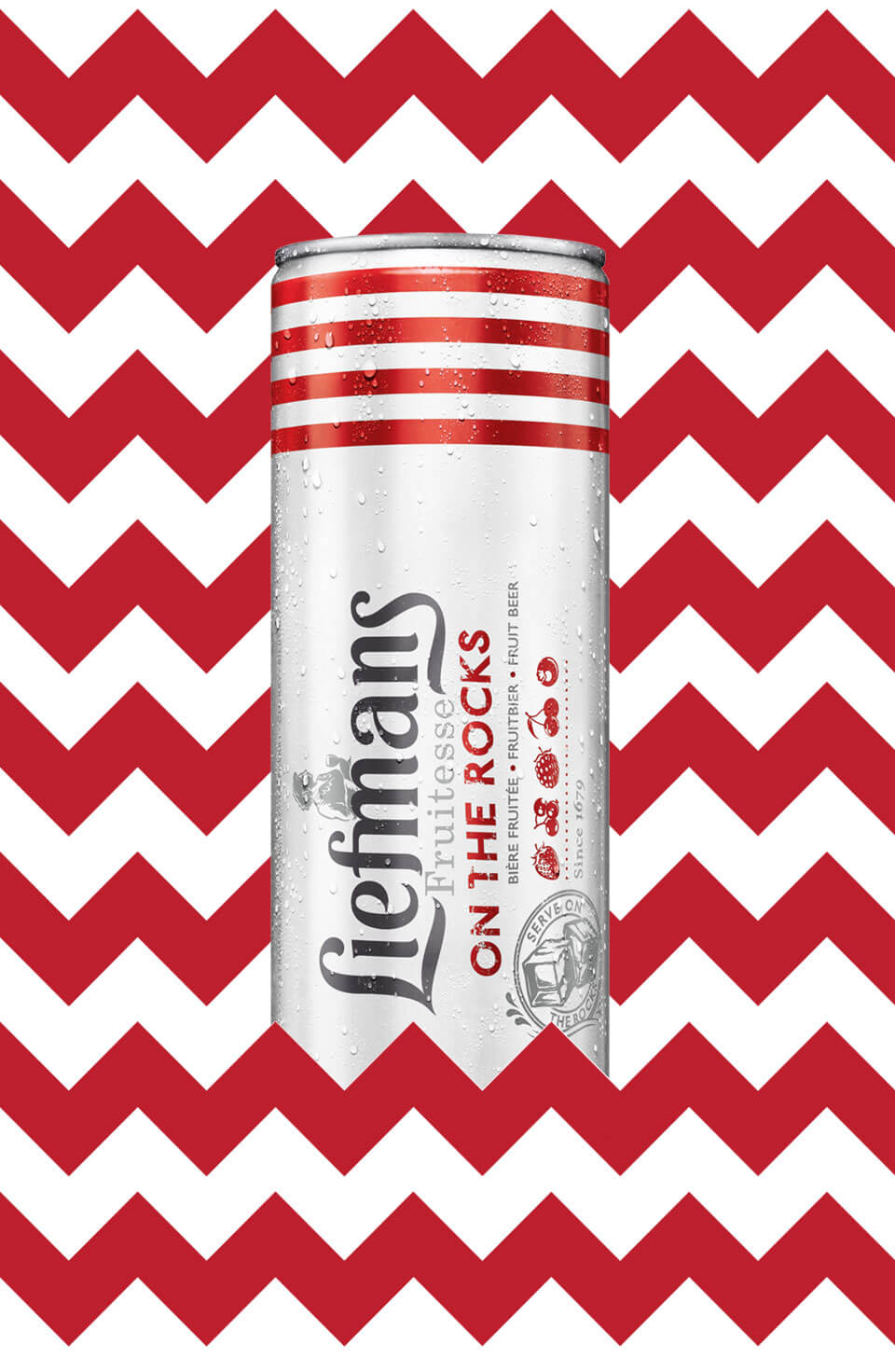
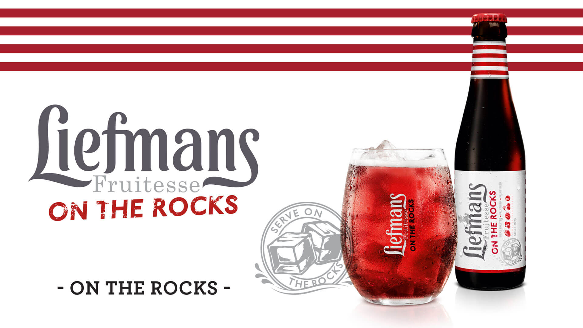
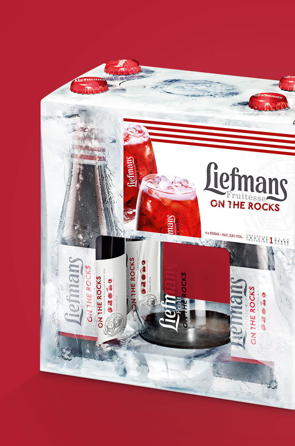
As part of the Duvel-Moortgat group, Liefmans came to us for the branding and postioning of their Fruitesse On the rocks. We foccused mainly on the product and serving ritual. By combining the Liefmans signature stripes with the white background it is clear that Fruitesse On the rocks is the refreshing threat on a sunny day. This product-focussed approach was implemented across the whole branding. From abribuses to instore-promotions and packaging.
CLIENT
Liefmans
AGENCY
Oskar D
CATEGORY
Art direction & Design





REBRANDING PROPOSAL
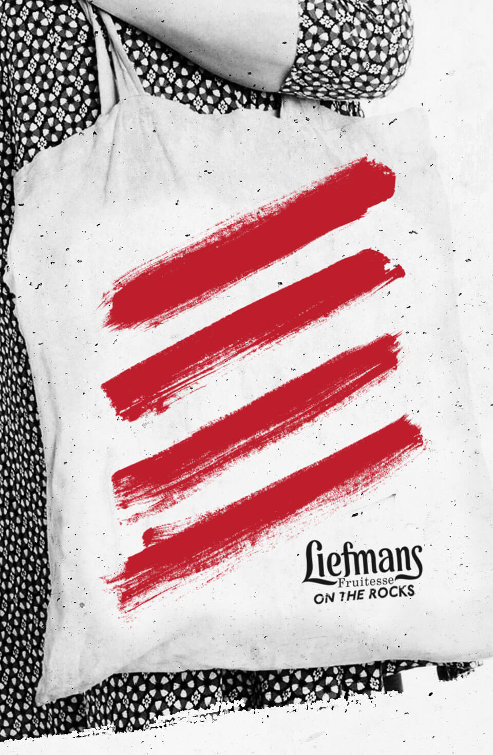
After it's first introduction Liefmans Fruitesse rapidly became a succes. The product and serving ritual found their way to the bars and terraces. This gave us the opportunity to take the branding a bit further and making it more iconic. We created some edge to make the brand more appealing to a larger group. The use of large patterns referring to the original Fruitesse stripes made the brand younger, more dynamic and recognizable.
